
Joey Cash has fourteen workspaces and they are all arranged the same way. This is worth five minutes because it is the difference between learning fourteen screens and learning one.
The five parts, top to bottom
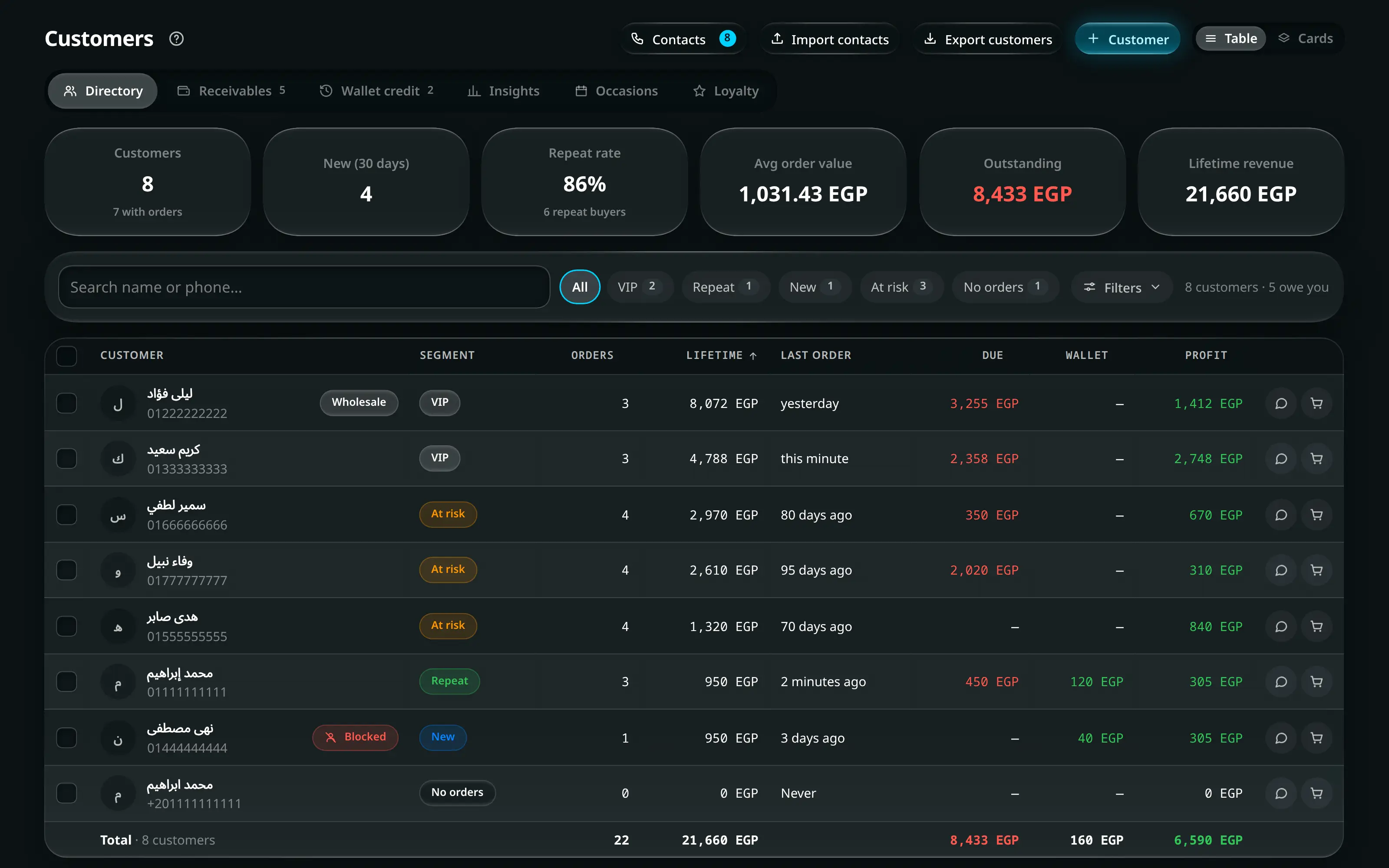
Customers. Same five parts, same order, as every other workspace.
Numbered on the screenshot
- 1Title, and the ? beside it that opens this wiki at the article for that screen. The name matches the tile you pressed and the article you land on.
- 2Actions. At most one is filled and glowing — that is what this screen creates. Every other action is a plain outlined button, and they all rank the same.
- 3Tabs — the view switcher. A tab changes what you are looking at.
- 4Search, which searches the list below and nothing else.
- 5Filters. One control, every filter behind it, and a count of how many are on.
- 6The whole toolbar. Search, quick chips and Filters live here; it narrows the current view without changing it.
1. The title and its actions
The title names the screen. Beside it, on the right in English and on the left in Arabic, sits the action row, and it has exactly two ranks:
- One primary action, filled and glowing: + Product, Start new session, Record Expense. It is what this screen creates. A screen that creates nothing has none.
- Everything else, outlined and identical: Export, Print, Cash transfer. They are deliberately not ranked against each other.
On a narrow screen only the primary survives in the row; the rest fold into a single labelled Actions4 button that opens a sheet.
The help mark beside the title
Every screen carries a small ? immediately after its name. It opens this wiki, in a new tab, at the article for the screen you are standing on — so the manual is one press away from the thing it describes, rather than something you go looking for.
It knows three things about you:
- Your language. An Arabic app opens the Arabic article.
- Your role. An administrator gets the full article. An employee gets the staff version of the same article, with the parts their account cannot reach cut out — so it never describes a button that is not on their screen.
- Your theme. If you have chosen light or dark in the app, the manual opens the same way. If you have left the app following your device, the wiki follows your device too.
2. The tabs
Directly under the title. A tab changes what you are looking at — Suppliers vs Workshops, Transactions vs Settlements vs Safes, Shipping vs Delivery.
A tab can carry a count, and it means something specific: something is waiting in there. Leaves3 means three leave requests need an answer. A tab with nothing waiting shows no number at all rather than a zero.
3. The toolbar
One card, under the tabs, holding everything that narrows the current view:
| Part | What it is |
|---|---|
| Search… | Searches the list below it, not the app. |
| Needs attention | Quick chips: one-press common filters. |
| Filters2 | Every other filter. The count is how many are applied. |
| Cards Table | Where a screen offers both, the display switch. |
Applied filters appear as removable chips when the panel is closed, so you can always see why a list looks short.
4. The body
One table, or one grid of cards. Never both at once.
Where a screen offers both, the card layout is the default on a phone and the table on a desktop, and your own choice overrides that and is remembered per screen and per device.
A card is a work queue entry, not a miniature record: identity and status, the customer, one line summarising the items, the money as a progress bar, and one or two signals worth acting on. Everything else is one tap away in the details modal.
Every table behaves the same way
There is one table in Joey Cash and every screen draws it. Once you know these six things you know all of them.
| The heading row stays put | Scroll a long list and the column names stay at the top of the screen, under whatever else is pinned there — the app’s own header, the screen’s toolbar, a dialog’s title. You never lose track of which column you are reading. |
| A column with a caret can be sorted | Press the heading once for one direction, again for the other. The caret shows which column is sorting and which way. Columns with nothing to sort by — a paragraph of notes, a row of badges — have no caret. |
| Figures sit on the reading edge | Money, quantities and counts line up against the same edge as their heading, so the digits stack and you can compare a column at a glance. A figure that carries a + or a − keeps the sign on the left of the number in both languages, because that is where a sign belongs. |
| The last row is the total | Where a total means something, the table ends with one. It adds up everything the filters let through, not the page you are looking at, and it says how many rows it counted. A column that nets two directions — money owed and money in credit, cash in and cash out — shows the net, with the two sides under it. |
| The last column is the row’s actions | Ghost icon buttons, and on a narrow screen they collapse behind one ⋯ so the figures keep their room. |
| A row you can open, opens with the keyboard too | Where clicking a row opens its record, so does Tab to it and Enter. A figure inside a row that drills into a breakdown is a link, underlined on hover — a figure that is only a figure is not. |
5. The selection bar
Tick a row and a bar appears at the bottom of the screen with the actions that apply to a selection. It exists only while something is selected.
Things that behave the same everywhere
Joey Cash does not use the browser’s own confirm boxes. Every confirmation is a panel that reads back the consequence in numbers — how many records, how much money, who is skipped and why — before the button.
Where a dialog says a bulk change will affect nine people and skip two, that is computed from your actual selection, not a template.
A bulk edit finishes with an Undo in the toast. It writes the previous values back through the same path that changed them, re-asks for permission, and skips anything someone else has changed in the meantime — telling you how many.
Actions that cannot be undone do not offer it. They ask first instead.
Hide figures on the home screen and Hide balances on the cash drawer frost over every money figure on screen. It is for the counter, where the customer can see your screen.
An administrator can require a privacy PIN to reveal them again — set in Resources → Settings.
A field you cannot leave empty carries a small Required tag beside its label. Where the reason is not obvious, the line under the field says it up front, e.g. Every order, till and report is filed under a branch. on a branch’s name.
If something is still missing or wrong when you save, nothing is sent. The problem is written under the field itself in plain words (Must be 0 or more, Enter a valid email address), the first field needing attention is scrolled into view, and the message goes away as soon as the value is right. A phone number is checked as soon as you leave the field, not only at Save.
A list with nothing in it says which list is empty and why — “no pay-later orders”, “this branch has never been closed” — rather than showing a blank area. If you are looking at a blank area, the screen is still loading.
Reading the rest of this wiki
Every article about a workspace opens with the same block: where it is, who can open it, its tabs, and what it writes. The last one is the one people skip and shouldn’t — it is the list of things that change in the database when you press the buttons on that screen.
Controls are drawn the way the app draws them: like this for a primary action, like this for a secondary, like this for a tab, like this for a field you type into, and F2 for a key on the keyboard.